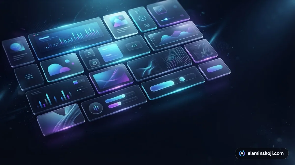
The best web design trends in 2026 combine bold, memorable visuals with speed, accessibility and websites that AI search can read. Trends only matter if they help visitors trust you and take action.
Here are eight trends worth using on a business website this year, plus a few to avoid.
1. Bento grid layouts
Bento grids arrange content in tiles of different sizes, like a lunch box. They make a lot of information easy to scan, which is perfect for showing services or features. You can see one in the services section of my own homepage.
2. Glassmorphism
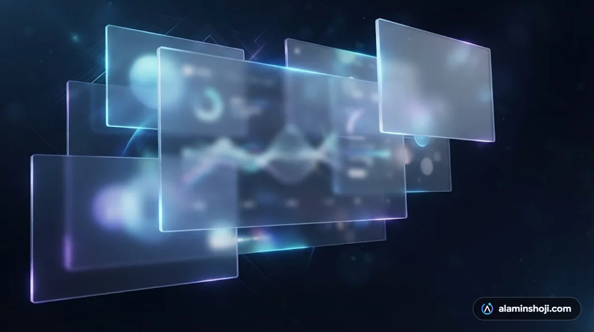
Frosted, semi-transparent panels with a soft blur make menus, cards and forms feel layered and premium. Use it for a few key elements, not everything, so text stays readable.
3. Scroll-driven animation and micro-interactions
Animations that respond as you scroll, such as charts drawing themselves or headlines revealing word by word, keep people engaged and guide them down the page. Small hover effects on buttons and cards make a site feel alive. The rule: motion should guide attention, never slow down the page.
4. Kinetic typography
Large, moving or rotating headlines turn your main message into the hero image. It is a strong way to stand out without relying on stock photos.
5. Dark mode done properly
More people browse in dark mode, and dark designs with bright accent colours look modern and premium. A good dark theme still needs strong contrast so every word is easy to read.
6. Websites built for AI search
Designers now plan for how AI tools read a site, sometimes called machine experience. That means clear headings, answer-first copy, FAQ sections and structured data, so Google AI Mode and ChatGPT can understand and cite your business.
7. Performance-first design
Speed is part of the design. Heavy 3D scenes and huge videos can hurt load times and conversions, especially on mobile. Use lightweight animation, compressed images and only the effects that earn their place.
8. Accessibility from the start
Good colour contrast, readable font sizes, clear labels and keyboard-friendly navigation help every visitor, improve SEO and reduce legal risk. It is now a design basic, not an extra.
Which web design trends should you avoid in 2026?
- Generic stock photos in the hero section. They look like every other site.
- Obvious AI-generated illustrations, which can make a brand feel cheap.
- Experimental navigation that makes people hunt for your menu.
- Animation for its own sake that delays your content.
How do you choose the right trends for your business?
Start with your goal. If you want calls, make the phone number and trust signals stand out. If you sell visually, lean into motion and bold layouts. Then add only the trends that support that goal, and test your site on a real phone.
Key takeaways
- Bento grids, glass effects, scroll animation and kinetic type make a site memorable.
- Speed, accessibility and AI-readable structure make it work.
- Every trend should help visitors trust you and take action.
Want a website that looks this good and brings in enquiries? Get a free website audit or see my web design service.